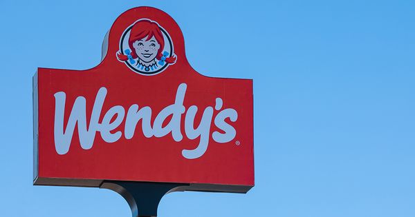
Anyone familiar with Wendy’s will surely recognize the freckle-faced girl with the red braided pigtails that graces its logo. She has become a beacon of hope for fast food enthusiasts. But there’s more to this girl than just a caricature – she unintentionally triggers a craving for home-cooked meals and a sense of comfort that the restaurant embodies.
In 1969, when Dave Thomas opened the now iconic Wendy’s, he wanted the restaurant to reflect the wholesome and inviting demeanor of his fourth child, Melinda Lou “Wendy” Thomas. Having worked for Colonel Sanders at Kentucky Fried Chicken, Dave understood the importance of a distinctive persona. So, he asked Wendy to pull her hair up into pigtails and captured her image on camera. In that moment, Wendy’s Old-Fashioned Hamburgers was born.
As the years went by, Wendy’s menu expanded beyond old fashioned burgers, offering a delicious Frosty and a bowl of hot chili. And while the restaurant evolved, its logo remained a potent symbol of nostalgia. A memorable tweak was made to the image of the redheaded girl in a blue and white striped dress, preserving the irreplaceable charm.
Imprinting Memories
In a redesign about a decade ago, Wendy’s embraced the essence of the original logo while giving it a modern twist. The updated version subtly softened the features of the mascot and refined the typography, making it appealing to new generations without alienating long-time fans. This delicate balance of modernity and tradition keeps the logo timeless while still evoking a sense of the past.
Upon closer inspection, some people uncovered a hidden message in Wendy’s latest design – “mom” can be seen written on the frilled collar of the brand’s poster girl. This subtle detail is believed to associate the brand with the comforting essence of home cooking. While it may take years for your conscious mind to notice it, this clever branding technique imprints the concept of warmth and nostalgia deep into your brain.
Interestingly, this “mom” effect is most evident in the monochromatic red version of the logo, often seen on Wendy’s Styrofoam cups. The illusion arises from the curve of the ruffled neckline, tricking our minds into feeling a connection to the comfort of mothers’ home-cooked meals.
Addressing the buzz surrounding this discovery, a Wendy’s spokesperson stated, “We are aware of this and find it interesting that our Wendy cameo has ‘mom’ on her ruffled collar. We can assure you it was unintentional.”
Regardless of the hidden message’s intent, the association of Wendy’s with warmth and family values continues to be a cornerstone of the brand’s identity. Now that you know the secret behind the Wendy’s logo, what are your thoughts? Share them with us and let’s hear what others have to say!
READ MORE
- Famed breakfast restaurant to close 150 locations by the end of 2025
- Classic Midwestern restaurant promises to revamp all 300 of its locations with a ‘vintage fresh’ look


